Showing posts with label paintings. Show all posts

Sunday, March 24, 2013

Recent Work

Here are some new paintings.  On my official website I'm calling them Drawings-Paintings since they're more spare and sketchy.  A couple or so will appear in or as more developed paintings...

 Sneaky Pigeons - acrylic on canvas board - 11 x 14 inches - 2013

 Like I Care What Polly Wants - acrylic on board - 11 x 14 inches - 2013

 Rather Rotund - acrylic on board - 12 x 12 inches - 2013

This fellow, above, appeared previously in my painting, "Ooo...  Goodies?"  Below is a painting that started out (never got past underdrawing) as one of a series of nudes I did some years ago that I was commissioned to do for sale on consignment.  Until recently, I'd folded the paper in half, using it as a folder, but I cut it at the fold and added the cat (you may also recognize from a previous painting) as well as a background from a recent issue of Elle Decor magazine.

 Cat, Guy, and Interior from Elle Decor - acrylic on paper - 11 x 17 inches

These two (the birds below, not the guy and cat...) will appear again in another painting that will include a landscape in the background.

Gray and White - acrylic on board - 18 x 24 inches - 2013

Also, once I have the files formatted and all that, I'm thinking these will be appearing over at Society 6 where you will be able to purchase print, i-whatnot, and maybe even throw pillow versions.

Ooo...  Goodies?

Wednesday, February 13, 2013

En route and new work


Doing a little open window action on a lovely winter day in the car on the way to Driftwood Vineyard for Tessa's (Tessa Bennetch, of Bells and Parks - she also took the picture) birthday.  I'm seen here with Liz Baker of The Baker Family.  Incidentally, I'm working on a painting for the Bakers for posters, I think.  Sorry, no work in progress photo just now.

Some recent paintings:

 Why don't you just shut up? - 16 x 18 inches - acrylic on canvas - 2012

A little more pared down than the usual, that one.  A little more usually pared, though... well less pared more usually... is this one.

Garden Walk - 18 x 24 inches - acrylic on canvas - 2012

Should have another post of work in progress soon.  Don't forget to check out Society 6 and musics: Mario Castelnuovo-Tadesco from Nancy Green and Frederick Moyer.

Any more space for colons and ellipses?

Wednesday, March 30, 2011

Dogs

At last: another update of paintings! Of course they've been on my official website for a while now, but haven't featured them here.

All of these continue the set I did on board, taking advantage of the brown ground.

I suppose I should have positioned the images side by side, since they are sort of companion pieces; you'll get the idea, though.

Open Parenthesis - 11 x 14 inches - acrylic on board

Closed Parenthesis - 11 x 14 inches - acrylic on board

Side by side, you get a better idea of the parenthetical theme and the top-bottom, rug relationship between the two paintings. Open them up in separate windows! Shuffle them around! The dogs are Morgan (open) and Oxnard (closed), whippets, who were my family's pets.

This next one is a pharaoh hound. I had a commission years ago to do a drawing of this fellow and recently (compared to the date I began the painting) came across some of the images for that work and thought to myself how interesting it would be to play the color of his coat off against the color of the board, connecting the lower and the upper, less developed sections of the board, foreground and background with the patterned, dog cushion dividing the image. I applied more paint to the dog area than originally intended, but am not dissatisfied with the result.

Pad - 11 x 14 inches - acrylic on board

I had originally intended that all in the set of paintings on board would be less finished in not just the background areas, but in general, with an overall sketch-like quality. Ah, well...

"Things that are Fuzzy," was supposed to have a background in the same manner as the grakle paintings, but I wasn't liking it, so I made it darker.

Things that are Fuzzy - 12 x 16 inches - acrylic on canvas

This is the only dog of the bunch that is still alive... my sister's little poodle, Tyrone. Anyway, after I darkened the background, I thought, "it looks like one of those George Rodrigue, Blue Dog paintings!"

It may be blue poodle paintings from here on out...

Sunday, January 16, 2011

A Bold Return

...or a return, at least, to incorporating people into my work as the principle subject.

A Cloudy Day at the Beach - 22 x 28 inches - acrylic on canvas

Originally, I started this piece as one of my Color-Panel paintings: at that time, the foremost figure, from a photo of a friend a friend of mine made when she was teaching in Japan (image not posted here), was more closely cropped by the sides of a smaller canvas; and if I remember correctly, I did not start it then because I was unable to decide on a background.

At some point, I was inspired by this image I saw in the April 2005 issue of House and Garden magazine, to include a figure in a similar pose, but reading, behind.


However, when I came back to this painting more recently, I thought I would paint one of the whippets (the skinny, white dogs in such works as my, "Winter Coats") sitting behind the front figure. The canvas, at this point, was going to be a taller, narrow canvas the same width as the originally planned size, though of course without the bars on the sides. Then I went back to the reader idea, combining several additional images for the model.

"A Cloudy Day at the Beach," is also a good example of my incorporation, collaging, of various sources. The pattern on the nearest swim suit and reader's towel are both adapted from Elizabeth Peyton's painting, "Ben Drawing,"

...the first of her paintings I saw - reproduced in the reviews section of Art in America or ARTnews. I was able, at that time, to find a few additional images of her work online. At any rate, enjoyed the look of her work, the drawing, use of color, and fluid application of paint, often dripping and running. I've yet to see her paintings except in reproduction, but do enjoy the images, so a bit of homage.

Though it doesn't appear as prominently in, "Beach," as in other works, I frequently use elements from scenic wallpapers such as this one from Griffin and Wong, for bits of foliage or to separate spaces.
The background finally presented itself this past Autumn when I visited an exhibition of paintings from the Walter's Museum (Baltimore) that was on view at the Blanton (here in Austin) in the form of Constant Troyon's, "Coast Near Villers.

A bit less foreboding, weather-wise, in my adaptation with a little change in topography. Originally, I was going to use another beach-scape by one, Ludovic Lepic, that was in the catalog to another exhibit, "Sargent and the Sea," which I saw this past summer at the Museum of Fine Arts in Houston. One of the paintings in that exhibition, "Neapolitan Children Bathing," from the Sterling and Francine Clark Art Institute in Massachusetts,

also ended up in my painting when I decided I needed some figures on the beach (also presenting an opportunity to pay tribute to Sargent, another long time favorite).

The little fellow with the floating devices pretty much demanded an update with bright orange water wings...

Sunday, January 9, 2011

CD Release!


The new CD from Nancy Green, concert cellist, which features my painting, "Spanish Early Evening Painting," (seen below in the non-album edit) is out now! Check out the track samples on her website, www.nancygreencello.com, and hop over to Cello Classics to order a copy of the CD. The company is U.K. so the price will ring up in pounds, but with shipping, it comes out to just under $20... when last I checked on the rate of exchange.

Even without my work on the cover, the album is worth owning: the music is a pleasure to listen to and Ms. Green has a style and sound I particularly like. Of course the performance is great.

A few of you, of course, know that I played cello in the past and am particularly sensitive to how the instrument sounds. dilitante! Though hardly a precise comparison, in describing her sound (after listening to her Tovey and Kodaly recordings) to a friend, I imagined her playing as being a Cabernet as opposed to a Pinot Noir, which I likened to the sound of Yo-Yo Ma (although Mr. Ma is one of those good Pinot Noirs one - who doesn't like that varietal - comes across and actually enjoys). On this most recent album, I think Ms. Green leans appropriately towards Tempranillo: nicely bodied but with a pleasing crispness.

I also have copies of her Brahms sonatas for cello and piano and the Tovey/Kodaly recordings, both of which I recommend. The Kodaly sonata for unaccompanied cello is a favorite: you should definitely get that one... you must have it!

The painting, if you are wondering, is not available. It is a favorite from the 2nd phase of my Flower-Pattern paintings from 2007 and sold some time before Ms. Green contacted me about using the image for her CD. In truth, she first contacted my gallerist, Dawn Chapman of Libertine Gallery after she'd seen the painting on the gallery's website, so special thanks to Dawn for having the image there and representing my work.

Remove Formatting from selection

Thursday, December 30, 2010

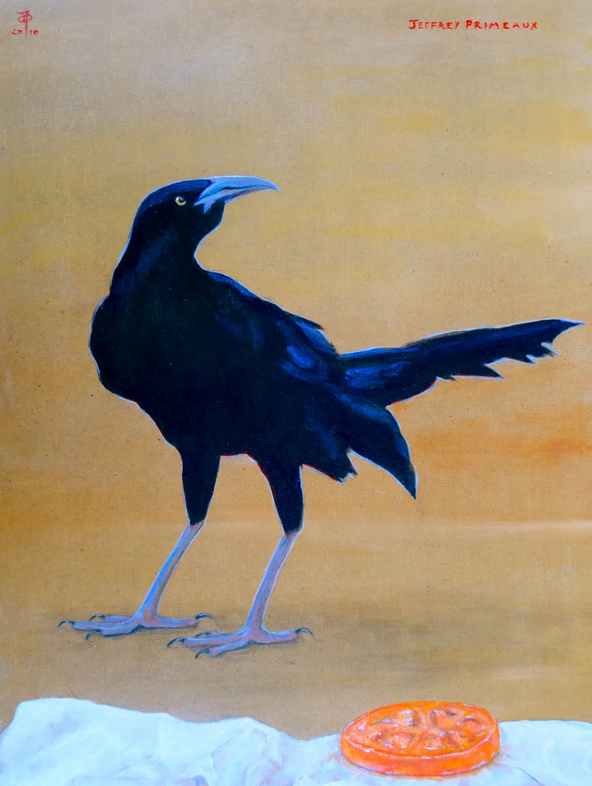
Grackles

Well, I have a number of new paintings, so rather than dropping them all into one post, I will make several smaller posts in which I may discus the featured images more at length. All of the new work is posted on The Official Website.

Recently, I've been interested in painting grackles and pigeons.

Tomato - 12 x 16 inches - acrylic on board

There Must be Something Good Around Here Someplace - 11 x 14 inches - acrylic on board

French Fries - 11 x 14 inches - acrylic on canvas

Common around Austin, especially during the Spring and Summer, grackles are amongst those critters that tend to be listed under the heading, "general nuisance:" noisy, messy birds, they are known for hanging around in large groups and lurking around eating spots, ready to snap up any random bit of stray food. They are, in fact, habituated to human/urban environments, and being amongst the relatively small number of creatures that dwell in said environments, have been mentioned as representing the lack of biodiversity in these locations.

At any rate, perhaps being scoundrels accounts for some of their appeal, but they also have odd characteristics that have certain charms; then males have beautiful iridescent coats while the females have less dramatic though also beautiful coats that transition from browns to blacks. Do birds have coats? I guess it's plumage.

Friday, July 16, 2010

Cat and Bird

Well, no work or receptions or attic cleaning the past couple days... I haven't know what to do with myself! Yes, should have been paintings - I have done work a bit, in truth, but it has been principally looking. I'm just getting started on a couple new pictures and returning to the squirrel and the young women on the beach (both in WIP sections somewhere down the page).

Oh yeah: thanks to the folks that made it out to the reception - nice turn out - good job keeping it non-regicidal. Thanks also to Anne Ducote, who arranges the shows at Hyde Park (and the openings and is an artist herself, ducotedesigns.com) and to Jeremy and the rest of the Hyde Park crew.

Here are the most recently completed paintings for which I'm still determining titles:

20 x 24 inches - acrylic on canvas

12 x 24 inches - acrylic on canvas

I need to rephotograph the second.

Maybe in my next entry I'll include a picture of a sampling of old wallpaper Bouquet brought back for me from the house in Tyler.

Monday, July 5, 2010

Reception, Ars Sacra, Et Cetera

I'll be having, or rather Hyde Park Bar and Grill will be hosting a reception for my artwork at the restaurant on Wednesday, July 14 (yes, that's Bastille Day), from 4:30-6:30 in the evening. They will be providing some snacks, water, and ice tea along with a cash bar for the cocktail hour beverages. The restaurant is located at 4206 Duval Street. I will be there too, of course.

The event will be regicide-free.

In the recently completed department and the Ars Sacra reference in the title:


Fr. Kevin Rai at San Jose Catholic Church here in Austin, commissioned me, a while back, to make a painting of the Miraculous Medal, a devotional medal representing a Marian apparition (perhaps that's not the best description, but I'll leave it to my readers to do the research and determine designation), that he might use for teaching about the medal. That occupied a good bit of time the past couple weeks before its delivery last Wednesday: of course it took me long enough to actually get it to canvas that I was determined to get it done and delivered before I should be declared irredeemably remiss. Anyway, it's 2 x 3 feet, acrylic on canvas board.

I need to photograph another recently completed work - perhaps today, since it's not wet out. I have a cat and a squirrel in the works, at least one of which will surely be out of the WIP category by the time I next post.

I forgot to put this one up the other month:

It's a companion piece B.B. Keville commissioned to go with this one, and has the same dimension and all that:


What else? Oh, yeah: update from the Antiquities Department. I decided, at least for the time being, to stop showing older work at Yessy.com. No sales, for one thing, over the year I've had stuff there; but also, such a glut of images! and I'm not sure mine are what most buyers there are looking to buy; and, since the money considerations are afoot, I've decided, rather than renewal at Yessy, to put the considerations toward entry fees for exhibitions... and perhaps an official website!

Wednesday, June 2, 2010

Koi Poloi

Yeah, goofy title.

I suppose it's been a while since the new koi painting appeared in a works in progress section of a previous entry: it was a while before additional progress, and then I really pushed to get it done in a couple or so days, painting with little enough time in between sessions that I didn't think to bother photographing the progress... or maybe I did think about it and decided not to bother...

Koi Pond 6 22 x 28 inches acrylic on canvas

I'm not sure that I'll be doing many more fish paintings - like I have been doing that many anytime recently - fish don't have a whole lot of personality. The painting has turned out rather nicely, though, so I have considered reconsidering: I was planning on doing a 3 x 4 foot, koi pond as I commenced this one, but then, like I said, fish don't have that much personality. Plus, unless I start doing reflection settings, or fishes out of water, or fish tanks in front of places (that idea is kind of amusing), the variety of fish settings that fit conceptually into my oeuvre is not so appealing to me for painting.

Meanwhile, back in the Antiquities Department...

Ceylon 18 x 24 inches acrylic on canvas 2003

I've been updating over at yessy.com. Most of the Color-Forms are up, a couple of the Tea paintings, and soon I'll get started posting the Tetrachromes. "Ceylon," is one of the earliest in this Pop Art series in which I combined tea bag envelopes with a variety of other images; in this case, a Fortnum and Mason, Orange Pekoe packet serves as the backdrop for a tiger with some bamboo and a waterfall taken from a Japanese screen.

Haven't sent the announcement out yet, but I have a show going up at Hyde Park Bar and Grill in Hyde Park (Austin, not London) this coming Sunday, June 6. I'll mention it again later.

This has been a brief post of recent news - a more content-heavy entry is planned for the near future.

Friday, May 21, 2010

Period Piece... and pieces...

The most recently completed of my new paintings:

Period Piece 18x24 inches acrylic on canvas

In a not usual case, the title for this one came about quite simply. Of course the background, adapted from a Zuber (or is it de Gournay?) wallpaper, suggests period piece movies like the sort of Jane Austen adaptation movies I like, but also, the inclusion of the now no longer extant, "Domino," and, "House and Garden," magazines hint at a more recent period and the use of the term, "period," also implies the punctuation mark, marking ends...

I think the implications there are sufficient to relieve me from waxing for numerous paragraphs.

I suppose if there's anyplace I should wax, it should be here, but perhaps I'll make a special waxing entry later.

Anyway, one of the changes I made to the Zuber (or de Gournay) original was to replace a tall monument with a shorter plinth featuring a Cupid and Psyche sculpture. If I could find my resources for the painting, I could tell you the sculptor - where are my resources? Interestingly, the sculpture depicts the scene in which Psyche spills oil from a lamp onto Eros... yeah, if you don't know the story go for a synopsis at pitt.edu/~dash/cupid.html or wikipedia, because it will take up too much space here and you should know it anyway... an important point in the story distinguishing a particular before from after period.

What does the pigeon have to do with the aforementioned periods theme? Uh, the eye is kind of like a red period punctuating in the middle of the painting? The pigeon was already there for the picture. I have an inkling, though, that the idea(s) of periods is relevant to/in my own work at present.

Meanwhile, back in the Antiquities Department...


I just photographed the Tetrachromes and Color-Form drawings (from the mid '90s) I still have around here to post over on yessy.com in hopes of finding nice homes for them and supplementing my coffers a bit.

However, before I do the posting of those there, I need to find my notes that include such important information as the titles...

This one (above), I know, is, "By Hand" - the images are, in green, a model's gloved hand in which I put a paper airplane; yellow, a blind man from a Japanese or Chinese (additional important information) ink drawing feeling his way across a log crossing a stream; red, a Republic of South Africa, postage stamp featuring a hydro-electric project dam; blue, the hand of a discobolus sculpture from a sketch I made from one of the casts at the University - but seeing the other Tetrachromes did not have

such the ringing-of-bells effect and as far as the titles for the Color-Forms go, those are given by color and number - though my memory of the chronology of their creation is good in general, it is not so exact in the specific.

The size is the same for all of them, about 14x17 inches (something else to check), is the same and all of them are chalk pastel on paper.

I've thought about doing some more of the Tetrachromes: they're kind of amusing in a random association sort of way, but I thought it might be a good, daily, drawing exercise to draw one color panel each day. Of course, if I end up with one completed drawing every four days (unless I don't work each day on the same drawing) I'll have a lot of these things around, but then maybe I can start an every-four-daily-artwork-to-sell-site and sell one each day which wouldn't be bad for the coffers... and would be good for hooking people up with quality, inexpensive art! Although the prices I've had for them is something else I'll have to look up in my records, so perhaps I shouldn't promise anything yet... but the outlook is good!

The text doesn't appear the same on the composing page as it does on the main... that's kind of annoying.

Monday, November 2, 2009

Showed Up

The Brick Oven Restaurant show is up now (1608 West 35th Street). If I say so myself, which I do, the work looks quite good in the place, an old house, intimate in scale, and with motled, tan-ish walls.

Here are pictures of the most recently finished paintings. The cat is still in want of a decent picture: I've tried several lighting situations, but as yet...